Nick Hudson and PANDA are wrong. Believing them is deadly
Vaccines are working in South Africa. Here’s the proof
Vaccine hesitancy is a big problem. The news has been filled in recent weeks with tragic stories of people who died of Covid-19 because they chose not to get vaccinated.
Most people don’t have the time to understand the complex details of how Covid vaccines work and how we know they are safe. Making the situation far worse is a deluge of misinformation confusing people, mainly on WhatsApp, Facebook and Twitter. It’s unsurprising that so many people are sitting on the fence about whether or not to get vaccinated.
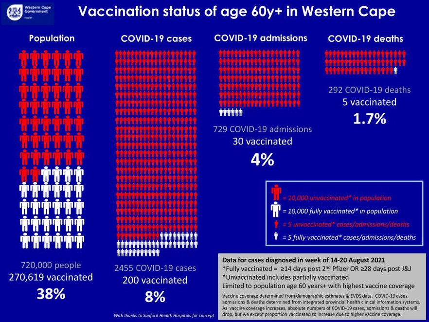
That is why this graphic produced by the Western Cape Department of Health last week is so important. It shows how amazingly effective Covid vaccines are.
There’s a wealth of information here, but this is the main point: In mid-August 38% of people over 60 in the Western Cape were fully vaccinated against Covid, but only 1.7% of the confirmed Covid deaths in hospital were vaccinated people.
If vaccines were ineffective we’d expect the percentage of Covid deaths among the vaccinated to be close to 38%, say somewhere between 30% and 50%. If vaccines were merely very effective, perhaps the percentage of Covid deaths among the vaccinated would be about 10%. But at 1.7%, the proportion of Covid deaths among vaccinated people is far below the proportion of vaccinated people in the province.
The graphic also shows that vaccines are excellent at reducing confirmed Covid infections (38% vs 8%) and hospitalisations (38% vs 4%).
Some of this effect, of course, might be due to other factors: Perhaps vaccinated people wear masks more and physically distance more than unvaccinated people, or differ from the population of unvaccinated people in subtle and material ways. But even if this is true — and it’s not clear that it is — this alone cannot explain such a huge difference in outcomes.
Also, this is a tiny fraction of the evidence of the effectiveness of vaccines; there have been large well-run clinical trials and many studies from across the planet showing that they are safe and effective. But the above graphic is a clear-cut demonstration that, as expected, the vaccines work very well locally.
Then came the anti-vaxxers
Professor Marc Mendelson is one of South Africa’s leading infectious disease experts. Besides being an accomplished scientist, he spends a good deal of his time trying to save the lives of Covid patients at Groote Schuur Hospital. Mendelson tweeted the above graphic, imploring people to get vaccinated. He did this for a good reason: nearly all his Covid patients are unvaccinated.
A man named Nick Hudson responded to Mendelson:
“You call that data? Where’s the denominator? Where are the partially vaxxed? How do explain the immense gap between what you’re suggesting and what has been seen in Israel and England? And where’s your declaration of conflicts of interest?”
Besides the obnoxious tone, Hudson’s questions betray that he does not have expertise on Covid. Let’s deal with each of his questions:
Hudson asks: “You call that data?”
Yes, it’s good data collected by the Western Cape Department of Health which has the best health information systems in the country.
Hudson asks: “Where’s the denominator?”
It’s not clear what he means but, aside from possible unknown differences between vaccinated and unvaccinated people, there is enough information in the graph to confirm that vaccine effectiveness at preventing death for people over 60 in the Western Cape is over 95%.
Hudson asks: “Where are the partially vaxxed?”
The partially vaccinated, as explained in the graphic, are counted as unvaccinated. This is the correct way to analyse the effectiveness of being fully vaccinated. But even partially vaccinated people have a lower risk of getting infected with Covid.
Hudson asks: “How do [you] explain the immense gap between what you’re suggesting and what has been seen in Israel and England?”
Actually data from Israel and England also show how brilliantly effective vaccines have been. This is not the article to explain that, but see here for the UK and here for Israel.

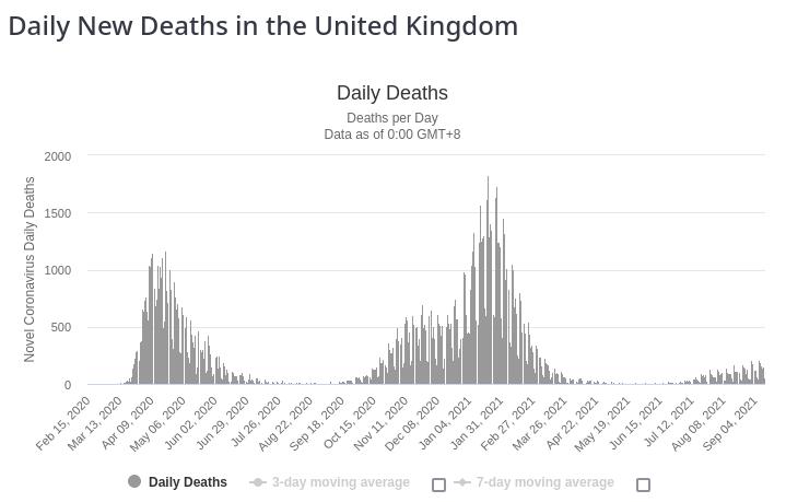
This graph of the United Kingdom shows that there have been far fewer deaths in that country’s current third wave than in the previous two waves. This is because most British adults are now vaccinated. Source: Worldometer
Hudson asks: “And where’s your declaration of conflicts of interest?”
Is he asking Mendelson this question? But it’s not Mendelson’s graphic or data; he just tweeted it. It’s the Western Cape Department of Health’s graphic. What could Hudson mean by asking the government what its conflict of interest is? It’s simply doing its job: publishing information in the public interest.
Before March 2020, Hudson was unknown to infectious disease scientists. He has no track record of scientific accomplishment. He is an actuary, but this does not make him an expert on epidemiology, virology, or any other branch of medicine or public health.
Hudson heads the most high-profile group driving vaccine hesitancy in South Africa. It’s called PANDA. This organisation has been spreading misinformation using what superficially appear to be scientific arguments. But on close scrutiny many of their claims are misleading and pseudoscientific.
It’s unclear why someone like Hudson has become a source of information for so many. He has made numerous claims and predictions about the epidemic which have turned out to be wrong. He is also frequently rude and patronising towards scientists and doctors who are doing their best to save lives and educate the public about Covid.
In the early days of the epidemic, contradicting all the experts, Hudson predicted there would likely be 10,000 Covid deaths in South Africa. About a year-and-a-half later Covid is still very much with us and the number of Covid deaths is still climbing. The Medical Research Council reports that there are now about 250,000 more deaths since May 2020 than we would have expected without the pandemic. Well over 200,000 of these excess deaths are directly due to Covid. This is a much higher number than the 85,000 official Covid deaths, which only includes confirmed Covid infections in hospitals.
Hudson has railed against masks even though it harms no-one to wear them. In indoor public places like schools or shopping centres there is now abundant evidence that masks, especially surgical ones, save lives.
Hudson tweets favourably about the antiparasitic drug ivermectin which has been touted by anti-vaxxers as a wonder drug against Covid, despite there being very little evidence showing this.
Most of his venom is reserved for lockdowns. The Free Market Foundation gave him a prize for his critique of lockdowns.
Now there are rational critiques of lockdowns, or at least the way they’ve been implemented. Leading infectious disease experts, like Glenda Gray, Shabir Madhi and Francois Venter, have criticised the way our lockdowns have been implemented. And Nic Spaull has critiqued the excessiveness of school closures.
But Hudson’s critiques are based on misinformation, disputing how infectious and deadly Covid is. Moreover, he frequently expresses scepticism about the two tools that can be especially effective at ending lockdowns: vaccines and masks. Ironically, it is the behaviour that Hudson encourages — not wearing masks and not getting vaccinated — that is making it so hard to put lockdowns behind us.
The data from the Western Cape is compelling and adds to the enormous amount of evidence that vaccines work. Don’t be fooled by the Nick Hudsons of this world. If you haven’t been vaccinated yet, please go do it as soon as possible - it could save your life.
Support independent journalism
Donate using Payfast

Next: SASSA investigating “escalating” fraud cases
Previous: How musicians are helping health workers cope with Covid
Letters
Dear Editor
I welcome your convincing message to the public about the effectiveness of SARS-CoV-2019 vaccines. As an analyser of data, I'd like to share with you an even more intuitive way of looking at the numbers.
With the assumption that the COVID-19 case figures given in the diagram are representative of the vaccination status of the underlying demographics, we can infer the "relative risk" of the following outcomes: "Infection (case) given non-vaccination (non-vac)" vs "Infection given vaccination (vac)" using what is known as Bayes' theorem, one of the most fundamental laws of probability. The formula is simple: relative risk = (rate of non-vac given case) times (rate of vac), divided by (rate of vac given case) times (rate of non-vac). Here the word "given" refers to the more technical concept of conditional probability: the chance of some event occurring conditional upon a certain premise. For example, in the diagram, we can read that the rate of vaccination *given* positive case is 8% - "positive case" is the premise: we're not counting the rate of vaccination at large, only for those connected with this specific requirement.
Plugging in the numbers, we arrive at an odds ratio = 6.9. In other words, the risk of a positive case is almost seven times as high for the unvaccinated compared to the vaccinated. The same reasoning can be done for the other conditions too, and we arrive at 14.3 for hospitalisation and 35.2 for death. Of course, for the latter two, we have less data and thus greater uncertainty and a higher risk of a biased sample. Nevertheless, this simple back-of-envelope calculation connects the data in an intuitive way to a concern of a member of the public: namely, how the choice of non-vaccination may actually multiply the risk of an undesirable outcome. This may be more readily interpretable than figures such as "38% vs 8%", which does not afford a straightforward "reading" that is both non-technical and well-reasoned.
© 2021 GroundUp. This article is licensed under a Creative Commons Attribution-NoDerivatives 4.0 International License.
You may republish this article, so long as you credit the authors and GroundUp, and do not change the text. Please include a link back to the original article.
We put an invisible pixel in the article so that we can count traffic to republishers. All analytics tools are solely on our servers. We do not give our logs to any third party. Logs are deleted after two weeks. We do not use any IP address identifying information except to count regional traffic. We are solely interested in counting hits, not tracking users. If you republish, please do not delete the invisible pixel.

